+ Team Project
+ Responsive Web Design
+ Qualitative Testing
+ Conversion Rate Optimization
+ Analytics
Compassion International is a child-advocacy ministry that works to release children from spiritual, economic, social, and physical poverty through its child development sponsorship program.
In August 2017, my team and I started working on improving the user experience of the Compassion.com home page, as the first stage of a whole-site responsive redesign.
My role in this project was to lead the user research and testing strategy, provide input into the visual design and review the design as it developed to ensure that it adhered to the organization's brand and web style guidelines.

CHALLENGE/PROBLEM

APPROACH
Content Evaluation
In the first phase of this redesign project, we needed to maintain the content from the original desktop homepage to get buy-in from stakeholders.
There are two main audiences that the homepage serves: (1) new visitors/non-sponsors, (2) returning sponsors/donors. As such, the content on the homepage was a mix of calls to action for new sponsorship acquisition, and campaigns targeting existing sponsors and donors; we needed to organize this information in a visual hierarchy.
Design
With the goal of creating a single, responsive homepage design with the current content, a prototype of the page was built using our Content Management System.
The elements on the homepage were simplified visually - copy that was in an image format was converted to text and image textures were removed. The elements were rebuilt to scale up and down and reflow as seamlessly as possible.

Testing
Qualitative tests were conducted to gauge the effectiveness of the new design in conveying the purpose of the site and the financial integrity of the organization to the user across desktop and mobile devices. The test methods used were 5-second (Impression) tests and surveys.
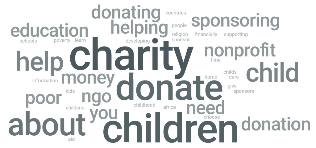
Overall, the feedback from the 5-second tests and surveys was on par with our expectations, and only a minor adjustment to the headline copy was needed before moving on to the next phase of testing - an A/B test.
RESULTS
Using Optimizely, we A/B tested the non-responsive homepage (control) and the responsive homepage design (variation). The metrics used to measure the success of the variation were overall revenue, child sponsorship conversions, and overall checkout conversions.

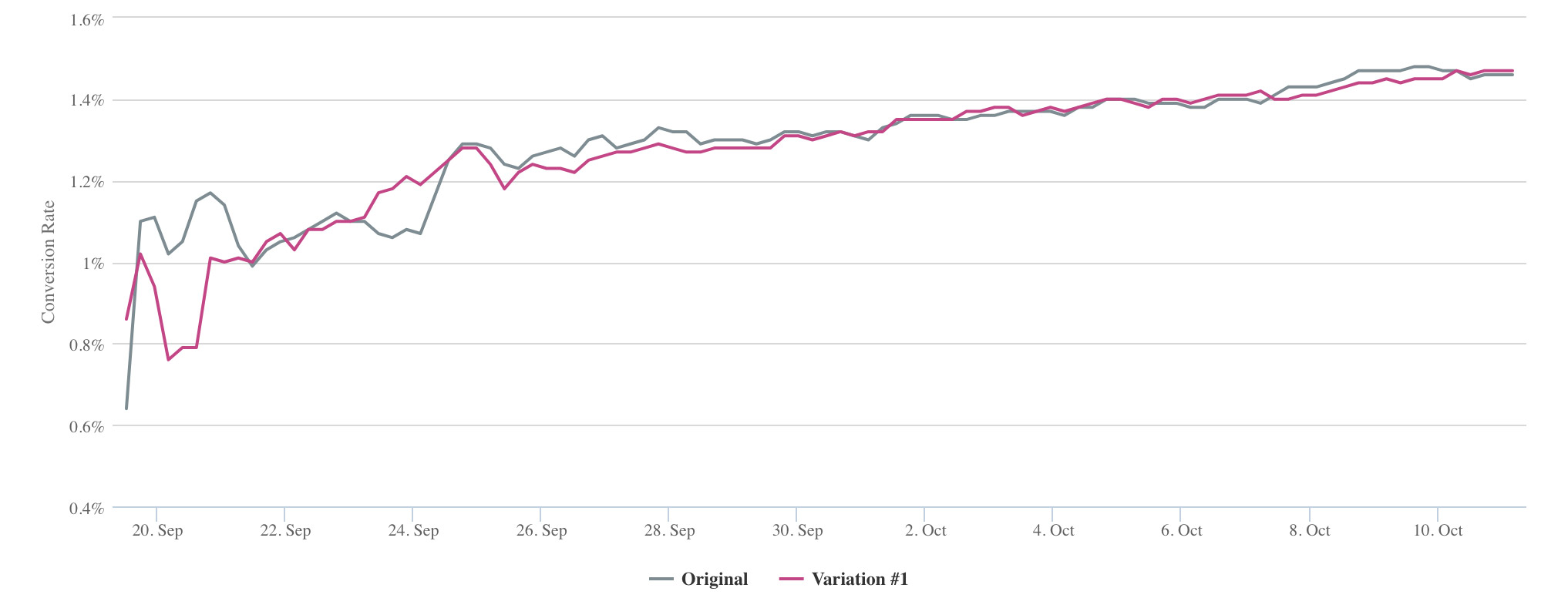
The variation had a 4.8% improvement in revenue and a 2% improvement in child sponsorship conversions. However, the results were not statistically valid. The test was live for 21 days, but the difference between the baseline and the variation conversion rates was not high enough to declare a winner without more time and traffic. Given the overall improvement in usability for mobile visitors and the general trend of improved conversion rates, the decision was made to move forward with implementing the responsive design (variation) as the new homepage.
SUCCESS
85.84% increase in revenue from the previous period
35.4% increase in average session duration
34.6% decrease in bounce rate from the previous period
The primary marker for the success of the project was an improvement to the overall usability of the homepage across devices - especially mobile since the previous version of the mobile homepage was not very user-friendly. This can be quantified by the Google Analytics data which shows an overall increase in revenue, a reduced bounce rate, and an increased average session duration.
Next Steps
As previously stated, the homepage serves both new visitors, and existing sponsors/donors. In order to deliver the most value to users, the next phase of this project is to create a personalized homepage experience. This will be accomplished by showing content that is most relevant to the user based on their status as either a known supporter or a new visitor.
For known supporters, we can display information on the homepage about their sponsored child and alerts related to their sponsorship account.
For new visitors, we can deliver strong value proposition about the ministry and its sponsorship program to help them make the decision to become a sponsor to a child in need.

Known supporter customized homepage
Sponsored child and account information displayed for easy access to common actions

New visitor homepage
Strong value proposition, clearly explaining "who we are" and "what we do"; clear call to action